Homework: Exploring Color, Value and Flesh Tones with a Limited Palette and a Portrait by Velazquez

At times I’ve been asked by students what they can do at home to continue their studies, so allow me to offer a concrete assignment:

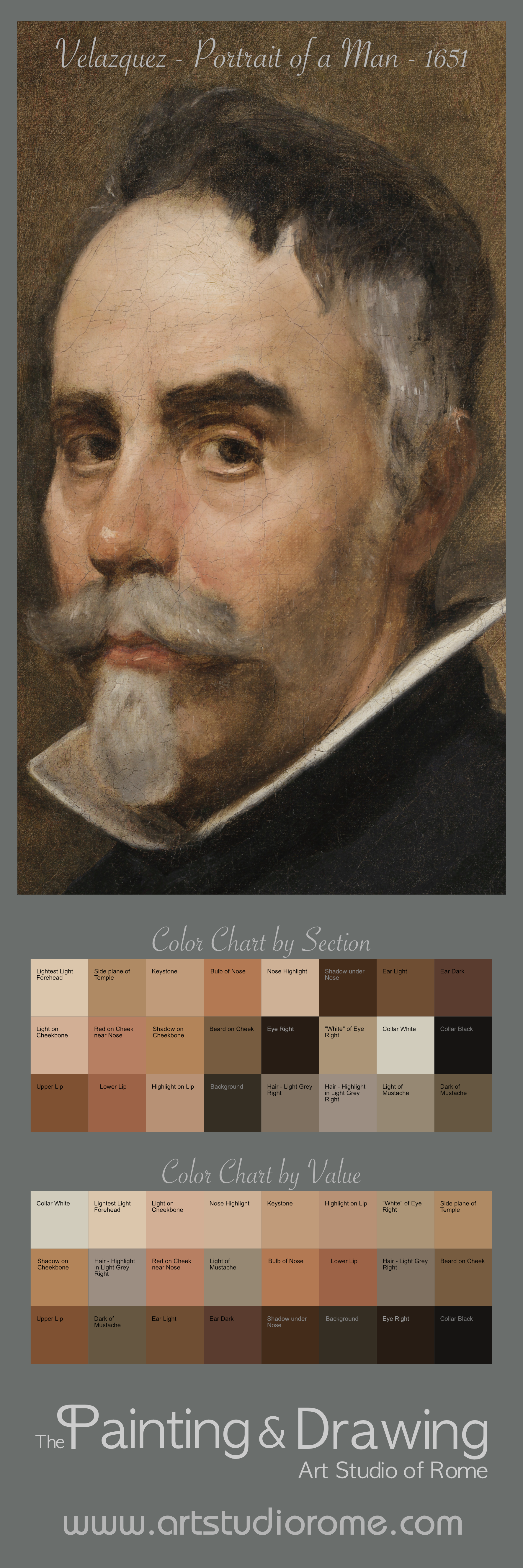
  1. Download the high resolution 300 DPI poster I’ve created of a Velazquez portrait.  (The previous link connects to a PNG file.  You can also download the file as a TIFF.)  Below the image you’ll find a two sets of color swatches that correspond to the colors in the portrait.  The first set is organized according to the location within the head; the second is organized by value, lightest to darkest.
  2. Take the image to your favorite printer and get a good quality print on matte photo paper.  The total size is 15 centimeters wide by 45 centimeters tall.
  3. Once you have the poster, hang it next to a canvas of similar size and start by laying in the drawing / underpainting using only Raw Umber and Lead White. (Getting the drawing first will help you focus on the subtle color shifts and value shifts later.)  Once you are satisfied with the drawing/underpainting, give it time to dry, then;
  4. Place the poster on a work table and lay a glass palette over the top set of swatches.  This will allow you easily mix colors and check them against the swatches.
  5. Colors for your palette: Lead White, Ivory Black, Raw Umber, Raw Sienna and Burnt Sienna.  (Yes, all colors you see in the image can be created using only this palette, except for a little bit of Vermilion and/or Madder for the lips.)
  6. You don’t need to mix up all the colors on the poster; just mix the first set of swatches that begin with the top part of the head.  Once you’ve mixed those colors, put the poster next to the easel so you can easily reference it again while you paint.  Repeat the process for each section of the head.

What I think you will discover:

  1. The subtlest shifts in color, value and temperature can turn a form.  Example: from the front of the forehead to the side of the head.
  2. As paint dries (even white) it will get darker, so may need more than one layer to get the colors to read with the proper saturation and luminosity.
  3. As you do add layers, note how the paint you are painting on affects the appearance of the layer you are adding.  Often times the subtle shifts come from a change in transparency of the top layer over the lower layer.  Capitalize on that.
  4. Finally, no matter how good your control of the color and value is, or how facile you are with your brushwork, the image will live or die in accordance with the drawing.  Never settle when it comes to drawing; pursue likeness to the hilt.  (Your pursuit may not result in perfection, but determined pursuit will always yield something that is hard to fully imagine.)

There you go.  I hope you will find this helpful.

If you do follow this exercise, please let me know how it goes using the comments below or through our Facebook page and send me your thoughts and results.

Cheers,

Tim

How to Calibrate Your Drawing from Life with a Camera, Computer and Image Editing Software

Max Doerner said “it is no more possible to learn to paint from books than to learn to swim on a sofa.”  A variation on that could easily be “it is no more possible to learn to draw from photographs than to learn to swim on a sofa.”

That said, I’ve realized in recent years that it can be very helpful to compare a life drawing to a photograph, especially given the ease with which it can be done.  Here’s what you need to do it:

  • A camera (an iPhone will do);
  • A computer (I use a Macbook Air);
  • An image editor (I use Adobe Fireworks from CS5, now discontinued; else Photoshop will work)

Step 1.  Take a picture of your drawing, then take a picture of your model, taking care not to get too close in order to avoid an overly distorted image.

Step 2.  Import both pictures into the image editor, placing one on top of the other.  If they are different sizes, don’t worry.

Here I have imported the photo of the model, Flavia.

Here I have imported the photo of the model, Flavia.

Step 3.  Scale the photo of the model to the drawing (Don’t worry if the model image gets pixelated.)  To do this, put the model image on top of the drawing image, set the model image to 50% transparency and increase (or decrease) the size of the image until it more or less coincides with one or more of the principle features; I usually target the eyes and nose.

With the image of Flavia at 50% transparency, I've matched the size of her image to the drawing below.

With the image of Flavia at 50% transparency, I’ve matched the size of her image to the drawing below.

Step 4.  Bring the model image back to 100% transparency and trace paths over the principle lines of the features: the contours of the head, the ears, the shadow around the eyes, the nose, mouth, chin, etc.

Here you can see the I've traced her features using a mouse and the pen tool in Fireworks.

Here you can see the I’ve traced her features using a mouse and the pen tool in Fireworks.

Step 5.  Turn off the model image and—voilà—you’ll immediately see right away what is right and what isn’t.

I centered the drawing on the nose, so that works. But the eyes are little too high (making the face seem longer) and her jaw on the right needs to be wider. It's amazing how these small errors can make a big difference!

I centered the drawing on the nose, so that works. But the eyes are little too high (making the face seem longer) and her jaw on the right needs to be wider. It’s amazing how these small errors can make a big difference!

One of my students, Stefano, also did a similar analysis, I believe with photoshop:

The eyes are very close, but note how dramatic the change is with the corrected line of the shoulders and the addition to the left side of the head.

The eyes are very close, but note how dramatic the change is with the corrected line of the shoulders and the addition to the left side of the head.

Bravo, Stefano!

Conclusion: avoid trying to improve you drawing by working from photographs, but take advantage of technology to help you calibrate your hand/eye coordination.  You’ll strengthen your sense of proportional relationships and start to realize things like a short jaw doesn’t mean make it longer, rather the mouth and nose are too low.  You’ll also become aware of where you have a tendency to err: I knew before starting the drawing that I tended to make noses too long—and during the drawing I moved it up twice!—but that still wasn’t enough.  Now it should be relatively easy to make some fixes… then I’m ready to transfer the drawing and start painting.